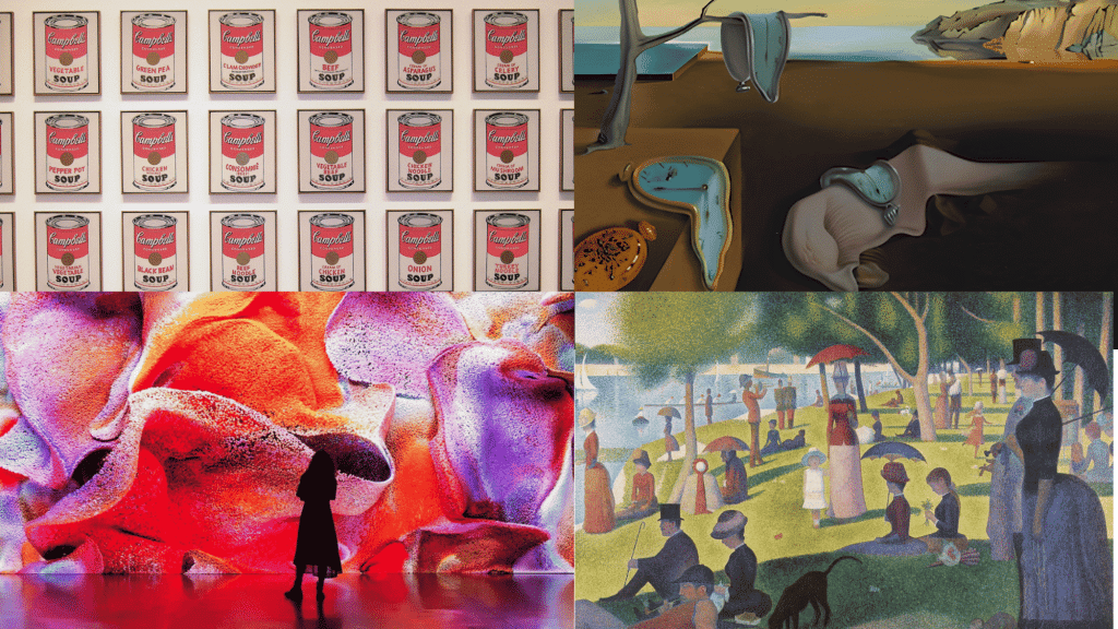

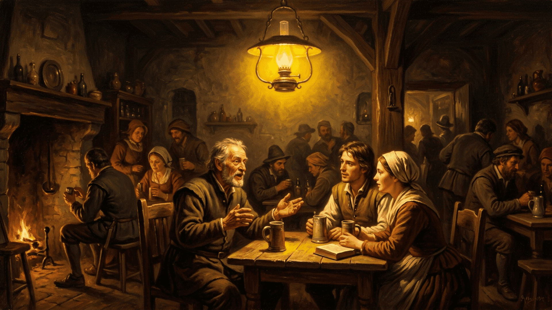
Most people look at a painting and feel something without knowing why. That feeling? It usually comes down to color.
Color is one of the most powerful tools an artist has. But to truly appreciate what artists do, it helps to understand color definition in art at a deeper level.
This blog breaks down what color means in art, the theory behind it, its key elements, symbolic meanings, and why it matters in every artwork. From the color wheel to emotional response, it’s all covered here.
Color Definition and Theory
Color definition in art goes beyond just naming shades. It is the result of light hitting a surface and the human eye interpreting that reflection.
Different wavelengths of light produce different colors, and the brain processes those signals into what is seen on a canvas or sculpture.
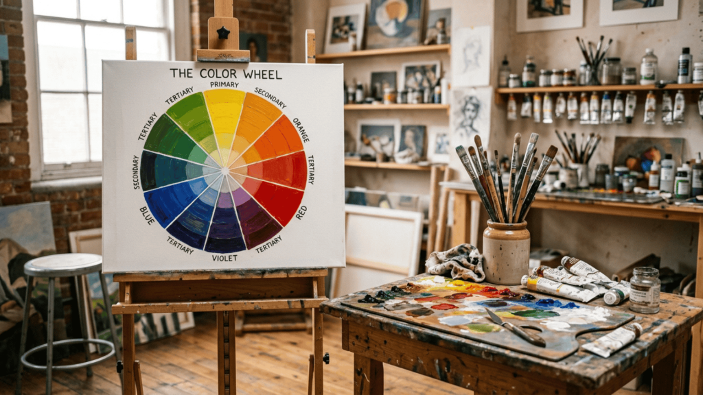
From an artistic perspective, color is a deliberate choice. Artists use the color wheel, developed by Sir Isaac Newton in 1666, as a foundational guide.
It organizes colors into three categories: primary colors (red, blue, and yellow), secondary colors (orange, green, and violet), and tertiary colors (combinations of primary and secondary colors).
Understanding these relationships helps artists control how colors interact, contrast, and complement each other within a composition.
Color theory, in short, is the framework that turns instinct into informed artistic decision-making.
Elements of Color in Art
Color definition in art is built on several key elements that help artists control how color appears and functions in any artwork.
- Hue: The pure form of a color, identifying whether it is red, blue, green, or another shade on the color wheel, and serving as the basic identity of color.
- Value: How light or dark a color appears, helping artists build contrast, define shapes, and add a sense of depth and dimension to the composition.
- Saturation: The purity of a color; high saturation appears vivid and strong, while low saturation looks more muted or dull in comparison.
- Temperature: Whether a color feels warm (red, orange) or cool (blue, green), influencing the mood and visual balance of the artwork.
- Color Relationships: How colors interact with each other, such as complementary, analogous, and triadic combinations, which create different visual effects in a composition.
Symbolic Meanings of Colors in Art
Colors carry meanings that go far beyond their visual appearance. In art, the meaning of a color shifts based on context, culture, and artistic intent
1. Red in Art
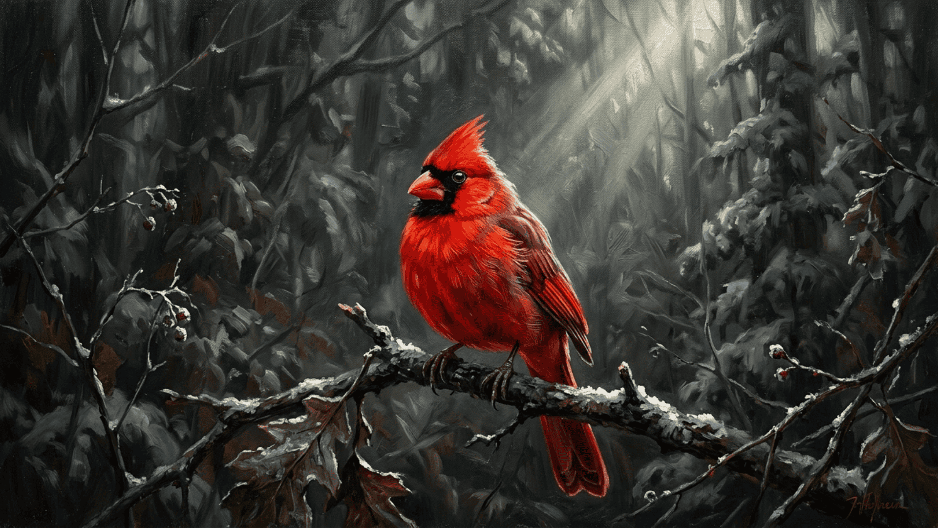
Red is one of the most emotionally charged colors in art. It is commonly associated with passion, love, danger, and power. Red is often used to draw attention to a focal point or create a sense of urgency in the artwork.
For example, a bright red subject placed at the center against a muted background immediately draws the viewer’s eye and creates intensity.
Understanding color definition in art means recognizing that red does not carry one fixed meaning. A deep crimson in a religious painting signals sacrifice, while a bright red in a modern piece might suggest energy or aggression.
2. Blue in Art

Blue is widely used in art to express calmness, sadness, and emotional depth. It is one of the few colors that can feel peaceful and melancholic depending on how it is applied.
Blue is used to set a quiet, reflective tone. In color in art, blue also plays a strong spatial role.
For example, a landscape with soft blue mountains fading into the distance creates a sense of depth and calm.
Darker blues tend to recede visually, creating a sense of distance or depth. This makes blue a common choice for backgrounds, skies, and water.
3. Yellow in Art
Yellow stands out as one of the brightest and most attention-grabbing colors in art. It is associated with energy, warmth, optimism, and at times, caution. Artists use yellow to highlight important areas or add liveliness.
To illustrate, a bright yellow light source in a painting can instantly draw attention and highlight key parts of the scene.
In color definition in art, yellow can shift in meaning based on its shade and surroundings. A pale yellow can feel soft and cheerful, while a harsh yellow may evoke anxiety or unease.
4. Green in Art

Green is strongly connected to nature, growth, and balance in art. It brings a sense of calm and stability, often used to represent life, renewal, and the natural world.
One example is a painting with layered green trees and grass that creates a balanced and grounded visual feel.
Artists rely on green to ground a piece visually and emotionally. That said, understanding color reveals that green is not always positive in meaning.
Murky or desaturated greens can suggest decay, illness, or unease. The tone and context shape how it is read by the viewer.
5. Black in Art
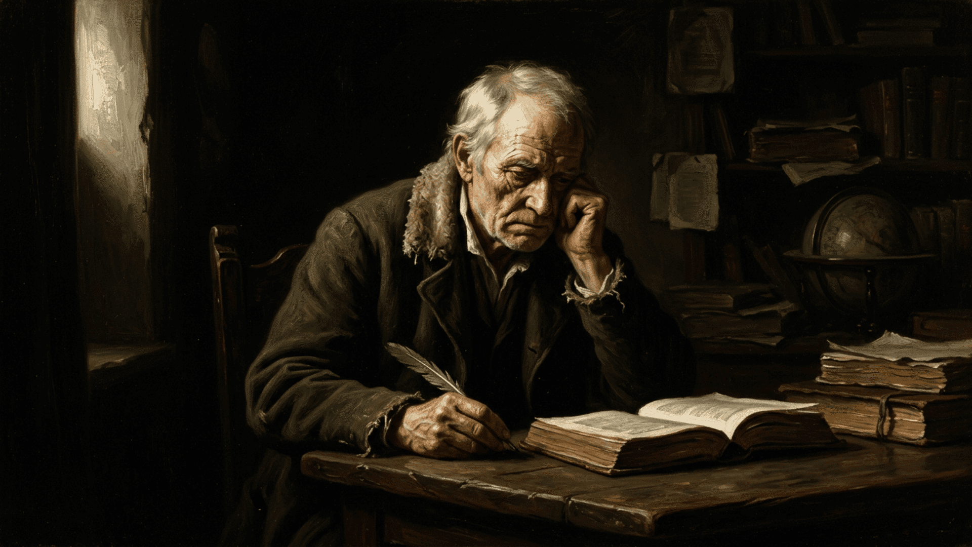
Black carries significant visual weight in art. It is associated with power, mystery, grief, and authority.
Artists use black to create contrast, add depth to shadows, and bring a sense of seriousness or drama.
For example, a painting with strong black shadows and bright highlights creates dramatic contrast and depth.
In color definition in art, black also functions as a structural tool in composition. It defines edges, anchors compositions, and makes surrounding colors appear more vivid.
6. White in Art
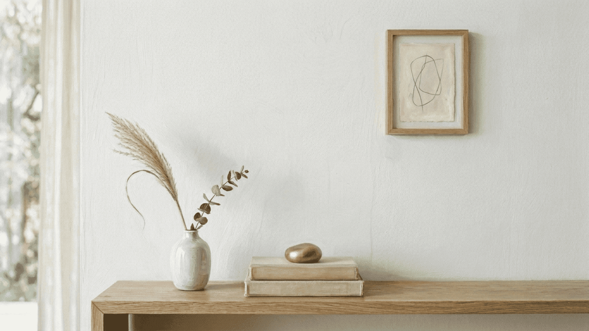
White is often linked to purity, simplicity, and stillness in art. It creates a sense of space and openness, giving the viewer’s eye a place to rest.
For instance, a minimal painting with large white space and few elements creates a calm and open visual feel.
White is used to balance busier areas and suggest clarity or calm. In use of color in art, white also communicates absence or silence.
Large areas of white can feel empty or serene depending on the subject, showing its emotional and compositional significance.
Color Relationships and Their Effects
Color definition in art is also shaped by how colors interact with one another. Different color relationships create distinct visual effects. This comparison helps show how each one functions in art.
| Color Relationship | Description | Visual Effect | Use in Art |
|---|---|---|---|
| Complementary | Opposite colors on the color wheel | Strong contrast and tension | Drawing focus to a focal point |
| Analogous | Colors sitting next to each other on the wheel | Harmony and visual unity | Creating smooth, natural transitions |
| Triadic | Three evenly spaced colors on the wheel | Balanced yet vibrant contrast | Building dynamic, energetic compositions |
| Monochromatic | Different shades and tints of one single color | Subtle, cohesive, and controlled | Minimal and mood-driven designs |
Common Mistakes in Using Color in Art
Even experienced artists can misuse color, weakening a composition. Knowing these common mistakes is a key part of understanding color definition in art.
- Using too many strong colors without balance: Placing many intense colors together without neutral breaks creates visual chaos and weakens the focal point.
- Ignoring value contrast: Focusing only on hue while neglecting light and dark differences flattens the composition and reduces depth.
- Assuming color meanings are universal: Treating symbolic meanings as fixed can lead to miscommunication across different contexts.
- Overusing one color scheme without variation: Relying on a single scheme makes the composition feel repetitive and less engaging.
- Mismatching color choices with subject or mood: Choosing colors that conflict with the intended tone creates confusion and weakens the message.
Conclusion
Color is far more than a visual quality; it is a language that artists use to communicate ideas, emotions, and meaning.
From understanding hue and value to recognizing how red signals danger or blue creates depth, every element of color serves a purpose.
Color definition in art is ultimately about making informed choices. When artists understand theory, symbolic meaning, and common mistakes, their work becomes more intentional and impactful.
Understanding color helps artists make more intentional choices in composition and meaning.
It shapes everything seen on a canvas, often before the viewer even realizes it